Get early access to PowerBISkills

Get early access to PowerBISkills

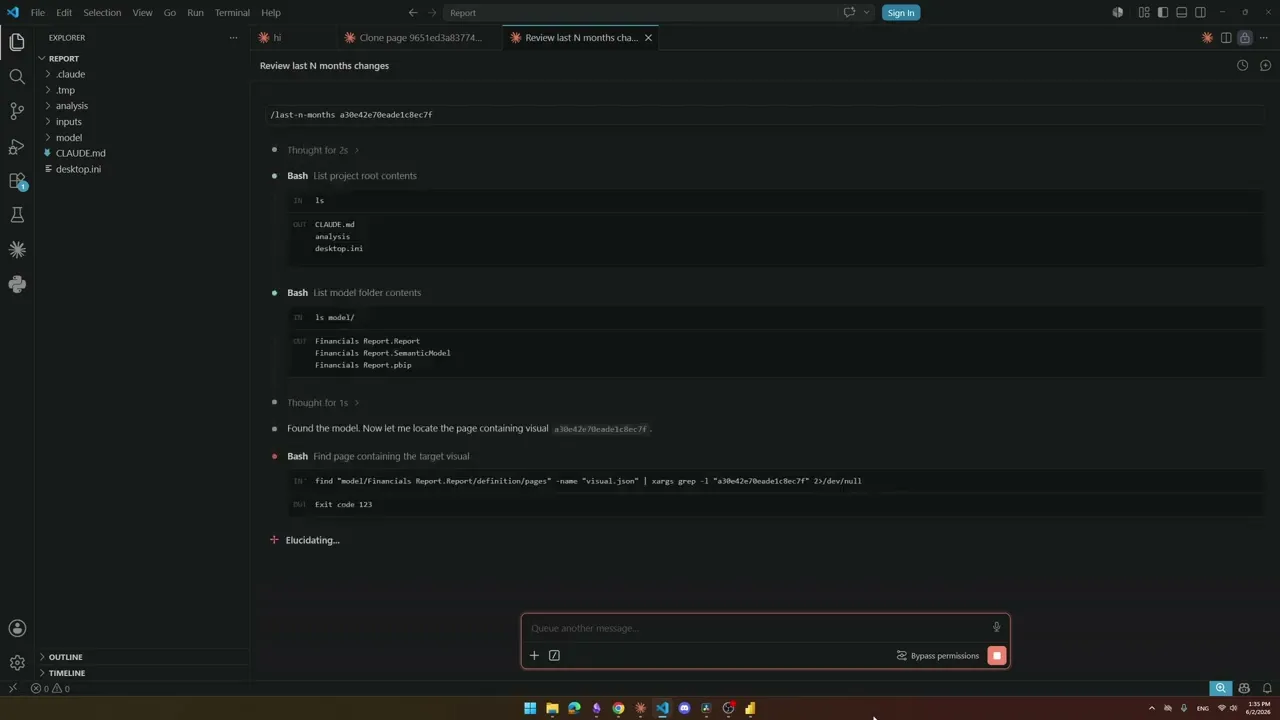
library of 35+ Claude Code skills that turn hours of Power BI work into single commands.

Hours of Power BI work, one command.

First access before public release

Launch pricing reserved for early subscribers

Direct line to me if you have questions

Sign up to be first when it opens.

Want to see it in action first?

List of available skills - ready to use

ANALYZE

Bookmark Analysis — Simulate bookmark navigation, detect visual leaks, and fix show/hide issues across bookmark chains.

Measure Killer Analysis — Identify unused measures, DAX complexity issues, and dependency health across your entire model.

Pbip Analysis — Evaluate star schema compliance, relationships, DAX patterns, Power Query, naming, and security in one pass.

Theme Auditor — Scan all visuals for hardcoded colors, fonts, borders, and backgrounds that override the active theme.

Titles Check — Audit every visible title and subtitle across your report.

Vpax Analysis — Evaluate your model against 30 VertiPaq rules.

BUILD

Absolute / Percentage Toggle — Add a two-button tile slicer to any chart that switches between absolute values and a percentage variant, with a dynamic format string and auto-derived chart title.

Active Filters Card Visual — Generate a card visual that dynamically displays all currently active slicer and filter selections.

Apply rounded — Convert standard column or bar charts to a lollipop "rounded column" style using Power BI's native error bar feature.

Clone Page — Clone any report page with all visuals and bookmarks.

Configuration Page — Add a dedicated configuration page to any Power BI report.

Configuration Panel — Add a popup slicer panel overlay to any Power BI report page.

Convert to Trendline — Add formatted data labels, markers, area shading, and a canvas tooltip to line chart visuals.

Create Tooltip — Analyze a chart's field wells, colors, and line styles, then build the complete tooltip infrastructure.

CY / PY Toggle — Add a two-button CY / PY slicer to any chart that switches between current-year and prior-year.

Information Panel — Add a popup information panel overlay to any report page.

Last N months — Add a numeric slider to any Power BI chart that lets end-users control the rolling window size.

Month Abbreviation — Replace long month names on a chart axis with clean single letters.

Paginate Visual — Add page-by-page navigation to any table, matrix, or chart with a horizontal page-number slicer.

Time Granularity — Add daily, weekly, monthly, quarterly granularity switching to any chart with a tile slicer.

Time Period Slicer — Create a period tile slicer with up to 8 rolling periods (L2W, L1M, L3M, L6M, L1Y, L2Y, L3Y, L5Y).

Time Period Slicer + Custom — Create period tile buttons (L2W–L5Y) plus a custom date range picker.

Top N Slicer — Add a RANK-based Top N filter to any chart with a numeric slider slicer, dynamic title, and scoped interactions.

Year Range Toggle — Add a tile slicer (CY, 2Y, 3Y and more) to any chart that restricts the visible year range.

FORMAT

Matrix Heatmap — Apply min/max, heatmap, top N, threshold, or positive/negative color formatting row by row.

Set Column Width — Set exact pixel widths for row headers and value columns in matrix and table visuals.

Sync X Axes — Synchronize X axis min/max so they share the same horizontal scale.

Sync Y Axes — Synchronize value axis min/max across multiple visuals so they align on the same scale.

DAX

ABC Classification — Classify dimension items (Products, Customers, SKUs) into A/B/C tiers based on any measure.

Pareto Chart — Add a Pareto (80/20) combo chart to any report page.

Rolling Averages Kit — Add 3-month, 6-month, and 12-month rolling averages plus a running total to any measure in your model.

Time Intelligence Kit — Generate 23 time intelligence items that apply to every measure in your model automatically.

DOCUMENT

Write descriptions — Generate business-friendly descriptions for every DAX measure and write them directly into your TMDL.

Write descriptions — Generate business-friendly descriptions for every DAX measure and write them directly into your TMDL.

OPTIMIZE

Convert Implicit measures to Explicit — Replace automatic column aggregations in visuals with proper DAX measures.

Remove duplicated measures — Detect measures with identical expressions and clean everything up.

Convert Implicit measures to Explicit — Replace automatic column aggregations in visuals with proper DAX measures.

Remove duplicated measures — Detect measures with identical expressions and clean everything up.

Common question

4,308 Power BI devs saved my launch video

Questions? DM me on

LinkedIn

Never miss a new Power BI AI skill.

Be the first to know when we drop new ready-to-use automation scripts for report building, DAX, and model auditing.

No spam. Unsubscribe at any time.