ABC Classification
Dynamic ABC Classification

Overview
Features
Prompts
Help
Key Features
ABC analysis answers which products are your A-class — the vital few that drive most of the revenue — versus the long C-class tail. The catch is that a static calculated-column version ignores your slicers: a product that's A-class overall can easily be B-class once you filter to one region. Building the version that reacts to slicers needs a proper ranking pattern with the right filter scope, a threshold table, and colour-coded series — fiddly DAX where the wrong scope quietly colours every bar the same. This skill does the lot from one command: it turns the chart you point at into a class-coloured ABC bar chart, writes the measures behind it, and re-tiers live as people slice — run it with /abc-classification.
How it works
Type /abc-classification, point it at the chart you want classified, answer two quick questions, and the skill builds everything:
Reads your chart — picks up the dimension to classify, the measure to rank by, and that measure's table straight from the visual
Asks two things — the A/B cut-offs (70% / 90% by default, or 80/95, 60/85, or your own) and which display folder the measures go in (default
_ABC)Writes the DAX — the ranking, class assignment, colours, per-class counts and values (11 measures in all, plus the green/amber/red colour measures), using the SQLBI WINDOW pattern so it re-tiers under any slicer
Adds a configuration table — a small ABC Configuration table holding the thresholds, read live, so you can retune the A/B cut-offs later just by editing it — no re-run
Turns the chart into the ABC bar chart — items sorted by the measure, split into A/B/C series coloured green/amber/red, replacing the chart you pointed at in place so its position, visibility, group, and filters all carry over
Matches your page — title font and background are read from the visuals already on the page, and the class sort survives bookmark navigation
What you get
An ABC bar chart — your chart, turned into items ranked by the measure and coloured green (A) / amber (B) / red (C), in the same spot with its group and visibility intact
Live re-tiering — apply a slicer and items move between classes and recolour in real time
The DAX behind it — 11 ABC measures (cumulative %, class, colour, per-class counts and values, plus switch measures) and the three colour measures, in an
_ABCfolderA configuration table — an ABC Configuration table holding the A/B thresholds, read live so you can retune them any time without re-running
Explore more in this category

Pareto Chart
DAX
Add a Pareto (80/20) combo chart to any report page
Rolling Averages Kit
DAX
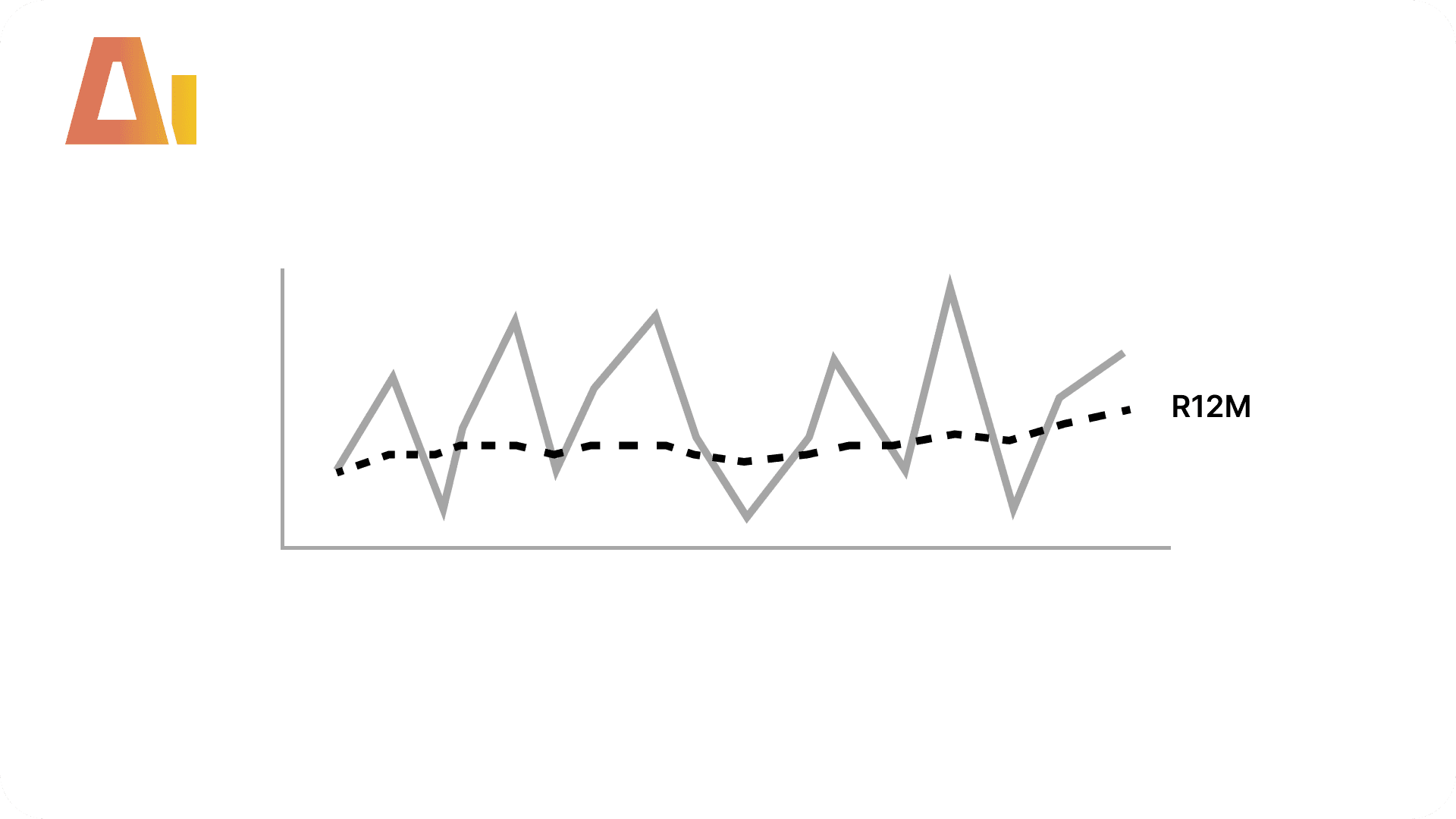
Add 3-month, 6-month, and 12-month rolling averages plus a running total to any measure in your model
Time Intelligence Kit
DAX
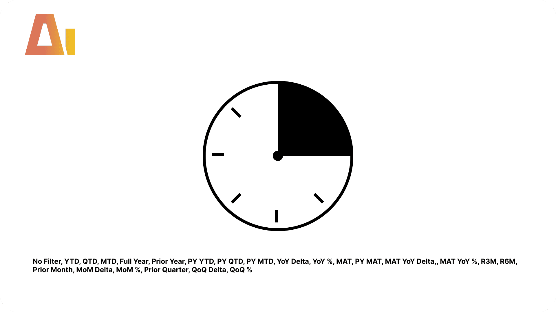
Generate 23 time intelligence items that apply to every measure in your model automatically
Tool Information
Skill
39 USD
Bundle (All skills)
249 USD
Category
DAX
Version
Version 3.2.2.2.6
or log in if you already have an account